Python樹林– category –
-

[Python] Accurately Get Monitor Resolution and Mouse Coordinates with PyAutoGUI
Overview This is a method to get the current screen size (resolution) and the current mouse cursor coordinates using the GUI automation library "PyAutoGUI." This is a fundamental implementation for identifying click positions and detecti... -
【Python】PyAutoGUIでモニタ解像度とマウス座標を正確に取得する
概要 GUI自動化ライブラリ「PyAutoGUI」を使用して、現在の画面サイズ(解像度)とマウスカーソルの現在地座標を取得する方法です。 自動操作スクリプトを作成する際、クリック位置の特定や、画面端の判定を行うための基礎的な実装となります。 仕様(入出... -
[Python] Basic Recipe for Automating Desktop Operations with PyAutoGUI
Overview This recipe uses the Python library PyAutoGUI to programmatically control desktop operations such as mouse movement, clicking, and keyboard input. This is useful for automating repetitive data entry tasks or GUI testing. We will... -
【Python】PyAutoGUIでデスクトップ操作を自動化する基本レシピ
概要 Pythonライブラリ PyAutoGUI を使用して、マウスの移動、クリック、キーボード入力といったデスクトップ操作をプログラムから自動制御するレシピです。 定型的なデータ入力作業や、GUIテストの自動化などに役立ちます。また、Linux環境(Ubuntu等)で... -
[Python] Creating Histograms and Visualizing Data Distribution with Matplotlib
Overview This recipe uses Matplotlib's hist method to create histograms (frequency distribution plots). We will explain how to draw clear histograms by adjusting parameters like the number of bins, colors, borders, and transparency to un... -
【Python】Matplotlibでヒストグラムを作成しデータの分布を可視化する
概要 Matplotlibの hist メソッドを使用してヒストグラム(度数分布図)を作成するレシピです。 データのばらつきや偏りを把握するために、階級の数(bins)や色、枠線、透明度などを調整して、視認性の高いヒストグラムを描画する方法を解説します。 仕様... -
[Python] Creating Pie Charts in Matplotlib: Adjusting Start Position and Order
Overview This is a recipe for drawing pie charts using Matplotlib. Default pie charts are often difficult to read. This guide explains how to create professional graphs for presentations by setting the data order to clockwise, adjusting ... -
【Python】Matplotlibで円グラフを作成し開始位置や並び順を調整する
概要 Matplotlibを使って円グラフ(パイチャート)を描画するレシピです。 デフォルトの円グラフは見づらいことが多いですが、データの並び順を時計回りにしたり、開始位置を12時の方向に合わせたり、配色を指定したりすることで、プレゼンテーションに適... -
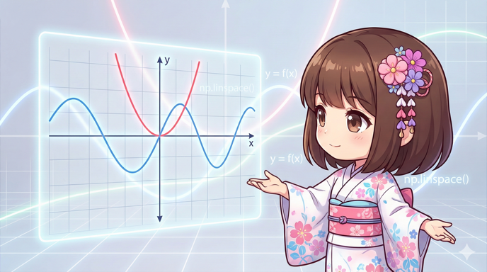
Plotting Function Graphs Based on Formulas with Matplotlib and NumPy
Overview This is a recipe for drawing mathematical function graphs in Python. Instead of entering point data manually, we use NumPy to generate an array for the domain (X-axis). By writing the formula directly into the code, you can effi... -
【Python】MatplotlibとNumPyで数式に基づいた関数のグラフを描画する
概要 Pythonで数学的な関数のグラフを描くためのレシピです。 手動で点データを入力するのではなく、NumPyを用いて定義域(X軸)の配列を生成し、数式をそのままコードに落とし込んで計算させることで、滑らかな曲線を効率的に描画します。 仕様(入出力)... -
Plotting Mathematical Functions with Matplotlib and NumPy in Python
Overview This recipe explains how to use the NumPy numerical calculation library to generate smooth sequence data and draw graphs of mathematical functions like quadratic and trigonometric functions using Matplotlib. Instead of creating ... -
【Python】MatplotlibとNumPyで数学関数のグラフを描画する
概要 Pythonの数値計算ライブラリNumPyを使用して滑らかな数列データを生成し、Matplotlibで二次関数や三角関数などのグラフを描画するレシピです。 手動でリストを作成するのではなく、数式に基づいて大量の座標点を自動生成することで、曲線を綺麗に可視... -
[Python] Customizing Line Plots in Matplotlib: Styles and Markers
Overview This is a guide for creating line plots using the plot method in Matplotlib. Beyond just drawing simple lines, we will explain how to control line styles (solid, dashed), colors, thickness, transparency, and data point markers t... -
【Python】Matplotlibで折れ線グラフを作成し線のスタイルやマーカーを装飾する
概要 Matplotlibの plot メソッドを使用して折れ線グラフを作成するレシピです。 単なる線の描画にとどまらず、線種(実線・点線)、色、太さ、透明度、データポイントのマーカー(記号)を細かく指定し、複数のデータ系列を区別しやすく可視化する方法を... -
Creating and Customizing Bar Charts with Matplotlib in Python
Overview This is a guide for creating customized bar charts using Matplotlib, a data visualization library for Python. We will explain how to control major parameters like bar colors, border thickness, width, and axis tick labels to crea... -
【Python】Matplotlibで棒グラフを作成し見た目や目盛りを詳細に設定する
概要 Pythonのデータ可視化ライブラリであるMatplotlibを使用し、デザインを調整した棒グラフを作成するレシピです。 単にグラフを表示するだけでなく、棒の色、枠線の太さ、幅、軸目盛りのラベル設定など、主要なパラメータを制御して見やすいグラフを作... -
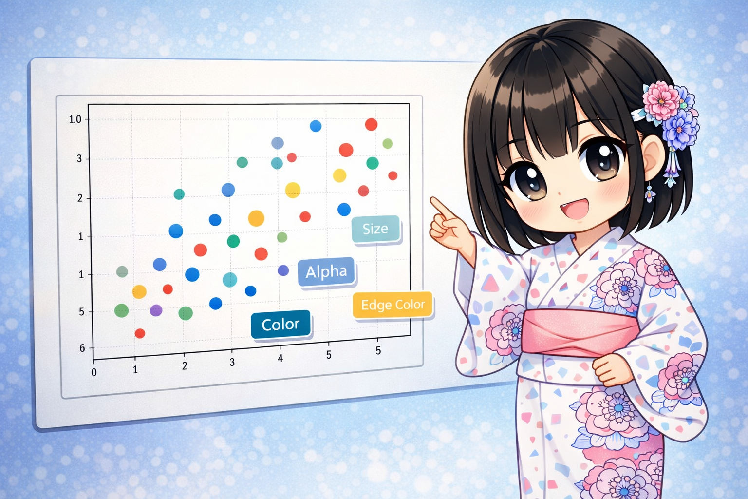
[Python] Comprehensive Guide to Matplotlib Scatter Plots (ax.scatter): Visualizing 3D and 4D Data
The ax.scatter method in Matplotlib does more than just plot points. By changing the "size" and "color" of the points, you can show 3D or even 4D information on a 2D graph. This article explains everything from basic plots to creating bu... -
【Python】Matplotlibの散布図 (ax.scatter) 徹底解説:3次元・4次元データの可視化とデザイン設定
Matplotlibの ax.scatter は、単に点を打つだけでなく、点の「サイズ」や「色」を変えることで、2次元のグラフ上に3次元以上の情報を表現できる強力なメソッドです。 この記事では、散布図の基本的な描画方法から、バブルチャートの作成、透明度や境界線を... -
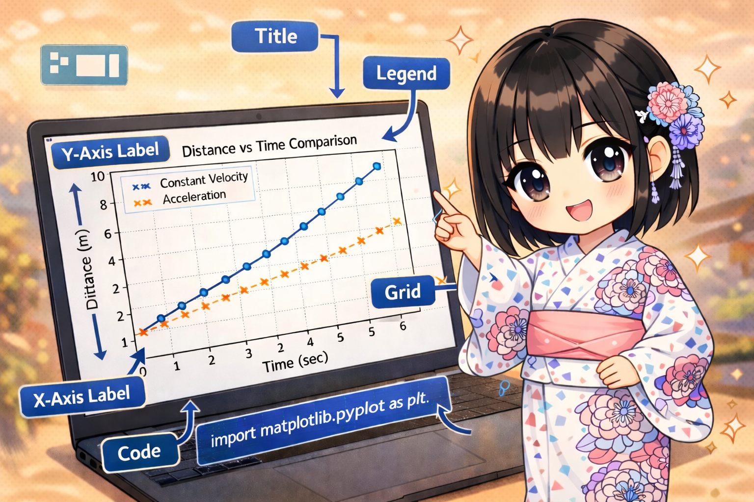
Setting Basic Graph Elements with Matplotlib Axes Objects
This guide explains how to set basic elements like titles, axis labels, display ranges (limits), grid lines, and legends using the Matplotlib object-oriented interface (Axes object). These elements are essential for making your data visu... -
【Python】Matplotlibでグラフのタイトル・軸ラベル・範囲・凡例を設定する基本パターンの解説
Matplotlibのオブジェクト指向インターフェース(Axesオブジェクト)を使用して、グラフのタイトル、軸ラベル、表示範囲(リミット)、グリッド線、凡例といった基本的な構成要素を設定する方法を解説します。 データの可視化において、これらの情報はグラ... -
Understanding Matplotlib’s Structure: Flexible Visualization with Figure and Axes
When using Matplotlib for data visualization, the first step to creating complex layouts is understanding the relationship between the "Figure" and "Axes." Relationship Between Figure and Axes Matplotlib graphs are managed in a hierarchi... -
【Python】Matplotlibの描画構造を理解する:FigureとAxesによる柔軟なグラフ作成
Matplotlibを利用してデータ可視化を行う際、描画の土台となる「Figure」と、個別のグラフ領域である「Axes」の関係を正しく把握することは、複雑なレイアウトを実現するための第一歩です。 描画の基本構造:FigureとAxesの関係 Matplotlibのグラフは、階... -
[Python] Differences Between Two Matplotlib Coding Styles: Pyplot and Object-Oriented
Two Main Styles in Matplotlib There are two main ways to create graphs using Matplotlib: the "Pyplot Style (MATLAB Style)" and the "Object-Oriented Style." The Pyplot style is simple and suitable for small scripts or quick data checks. I... -
【Python】Matplotlibの2つの記述法:Pyplot形式とオブジェクト指向形式の違い
Matplotlibにおける2つの主要なスタイル Matplotlibを用いたグラフ作成には、大きく分けて「Pyplot形式(MATLABスタイル)」と「オブジェクト指向形式」の2種類の記述方法があります。 Pyplot形式は記述が簡潔で、小規模なスクリプトやクイックなデータ確... -
[Python] How to Cross-Tabulate and Aggregate Data with Pandas pivot_table
Summarizing Data with pivot_table Method The pivot_table method in Pandas allows you to organize large amounts of data and create cross-tabulations. Similar to the pivot table feature in Excel, it is a powerful tool for calculating avera... -
【Python】Pandasのpivot_tableでデータをクロス集計・集約する方法
pivot_tableメソッドによるデータの要約 Pandasの pivot_table メソッドを使用すると、大量のデータを特定の切り口で整理し、クロス集計を行うことができます。Excelのピボットテーブル機能と同様に、行と列を指定してデータの平均や合計を算出する際に非... -
How to Extract Data from Specific Levels of a MultiIndex in Python
Managing Hierarchical Data with MultiIndex In Pandas, you can use a "MultiIndex" to manage data with multiple levels of row indexes. This is very useful for organizing data with complex structures. For example, you can manage data with a... -
【Python】MultiIndex(マルチインデックス)の特定の階層データを抽出する方法
MultiIndexによる多階層データの管理 Pandasでは、行インデックスに複数の階層を持たせる「MultiIndex」を使用することで、複雑な構造を持つデータを効率的に整理できます。例えば、「支店名」とその下の「部署名」といった親子関係にあるデータを一つのデ... -
Sorting Data with the sort_values Method in Pandas
Basics of Sorting Data with the sort_values Method In a Pandas DataFrame, you can use the sort_values method to sort data based on specific column values. You can set detailed conditions, such as primary and secondary sort keys, by provi... -
【Python】Pandasで複数列を条件に指定してDataFrameをソートする方法
sort_valuesメソッドによるデータ並べ替えの基本 PandasのDataFrameにおいて、特定のカラムの値を基準にデータを並べ替えるには sort_values メソッドを使用します。単一の列だけでなく、複数の列をリスト形式で指定することで、第1優先、第2優先といった...