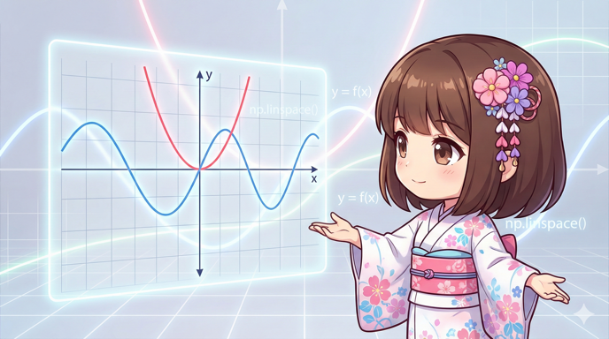
Overview
This is a guide for creating line plots using the plot method in Matplotlib. Beyond just drawing simple lines, we will explain how to control line styles (solid, dashed), colors, thickness, transparency, and data point markers to make different data series easier to distinguish and visualize.
Specifications
- Input: X-axis data (lists, etc.), Y-axis data (lists, etc.), and decoration parameters (format strings, colors, widths, etc.).
- Output: A graph displayed in a window or saved as an image file.
- Requirements: The
matplotliblibrary must be installed.
Minimum Usage
import matplotlib.pyplot as plt

x_values = [1, 2, 3, 4]
y_values = [10, 20, 15, 30]

fig, ax = plt.subplots()
# The simplest way to plot
ax.plot(x_values, y_values)
plt.show()
Full Code Example
The following code demonstrates four different data series, each using a unique style (solid, dashed, dash-dot, dotted) and markers.
import matplotlib.pyplot as plt
def main():
# 1. Prepare datasets (e.g., four sensor values over time)
time_points = [0, 1, 2, 3, 4, 5]
sensor_a = [10, 12, 15, 14, 18, 20]
sensor_b = [20, 18, 16, 15, 12, 10]
sensor_c = [5, 8, 5, 8, 5, 8]
sensor_d = [15, 15, 20, 20, 25, 25]
# 2. Create the drawing area
fig, ax = plt.subplots(figsize=(8, 6))
# 3. Plot the graphs with specific styles
# Pattern A: Solid line, Red, Thick, Star marker, Opaque
ax.plot(
time_points, sensor_a,
fmt="-", # Line style (solid)
c="#FF5733", # Color (Hex)
linewidth=3, # Line width
marker="*", # Marker shape
markersize=10, # Marker size
alpha=1.0, # Transparency
label="Sensor A"
)
# Pattern B: Dashed line, Green, Standard width, Circle marker, Semi-transparent
ax.plot(
time_points, sensor_b,
fmt="--", # Line style (dashed)
c="green", # Color (Name)
linewidth=2,
marker="o",
alpha=0.7,
label="Sensor B"
)
# Pattern C: Dash-dot line, Blue, Thick, Diamond marker
ax.plot(
time_points, sensor_c,
fmt="-.", # Line style (dash-dot)
c="blue",
linewidth=2.5,
marker="D", # Diamond
alpha=0.6,
label="Sensor C"
)
# Pattern D: Dotted line, Purple, Thin, X marker
ax.plot(
time_points, sensor_d,
fmt=":", # Line style (dotted)
c="purple",
linewidth=1.5,
marker="x",
alpha=0.8,
label="Sensor D"
)
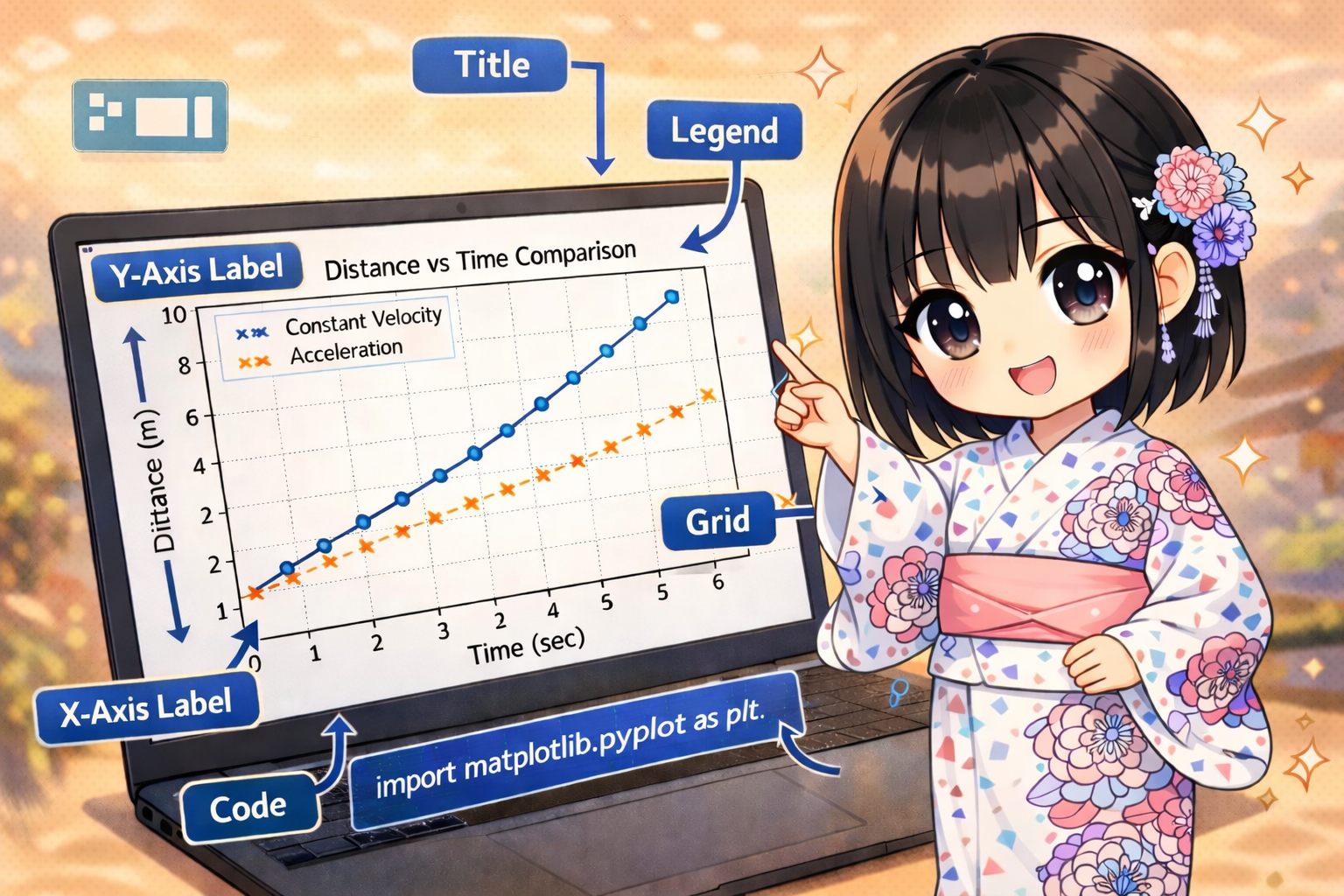
# 4. Configure Title, Labels, Legend, and Grid
ax.set_title("Sensor Readings Over Time")
ax.set_xlabel("Time (h)")
ax.set_ylabel("Value")
ax.legend() # Displays content from 'label' arguments
ax.grid(True) # Displays grid lines
# 5. Display
plt.show()
if __name__ == "__main__":
main()
Customization Points
The following table lists the main parameters for controlling the appearance of graphs using the ax.plot() method.
| Parameter | Description | Examples |
| x | X-axis data (indices are used if omitted). | [0, 1, 2] |
| y | Y-axis data. Required. | [10, 20, 15] |
| fmt | Short-hand string for line type, marker, and color. | '-' (Solid), '--' (Dashed), 'ro-' (Red, Circle, Solid) |
| c (color) | Line color. Name or Hex code. | 'red', '#00FF00' |
| linewidth | Line thickness (in points). | 1, 2.5 |
| alpha | Transparency (0.0 to 1.0). Affects both line and marker. | 0.5 (Semi-transparent), 1.0 (Opaque) |
| marker | Shape of symbols for data points. | 'o' (Circle), 's' (Square), '^' (Triangle), 'x' (X) |
- fmt vs linestyle: You can specify line types either through
linestyle='--'or as a short-hand infmt(e.g.,'--'). - Emphasizing Markers: To make markers stand out, you can adjust
markersizeormarkeredgecolor(marker border color).
Important Notes
- Parameter Priority: If you specify a color in
fmt(e.g., ‘r’ in ‘r–‘) and also use thecolorargument, thecolorargument usually takes priority. It is best to use one method to avoid confusion. - Data Consistency: The length of the X and Y lists must match exactly. Otherwise, a
ValueErrorwill occur. - Avoiding Over-Styling: Making lines too thick or markers too large can make data overlap and become hard to read. Use
alphato add transparency and make overlapping points visible.
Variations (Optional)
Step Plot
If the value changes are discrete (such as inventory levels), a step plot is more suitable than a regular line graph. Use the drawstyle argument.
import matplotlib.pyplot as plt

def create_step_plot():
    days = [1, 2, 3, 4, 5]
    stock = [50, 50, 30, 30, 20]

    fig, ax = plt.subplots()

    # Use drawstyle='steps-post' for a stair-like drawing
    ax.plot(days, stock, drawstyle='steps-post', marker='o', label='Stock Level')

    ax.set_title("Inventory Level (Step Plot)")
    ax.legend()
    plt.show()

if __name__ == "__main__":
    create_step_plot()
Summary
The Matplotlib plot method is highly versatile. By combining fmt, marker, and linestyle, you can create expressions tailored to your data’s characteristics. When overlaying multiple lines, changing not just the color but also the line style and markers helps ensure the graph is readable even in black and white or for users with color vision deficiencies.