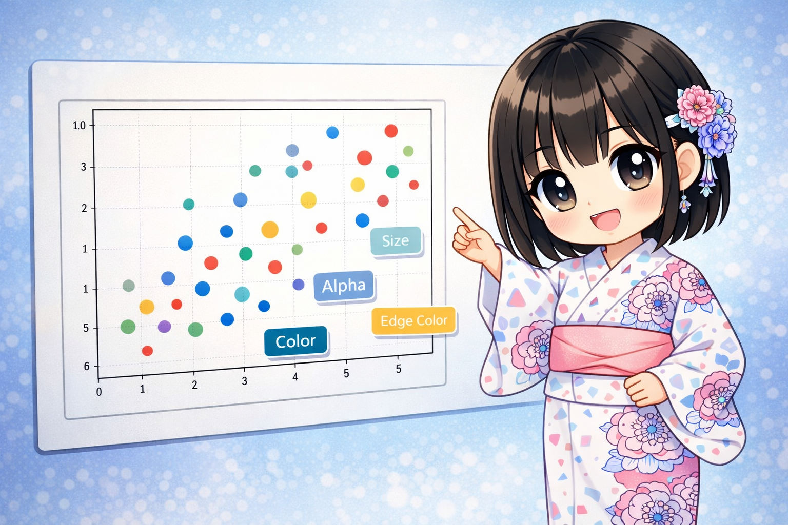
The ax.scatter method in Matplotlib does more than just plot points. By changing the “size” and “color” of the points, you can show 3D or even 4D information on a 2D graph. This article explains everything from basic plots to creating bubble charts and professional design adjustments using transparency and borders.
Creating a Scatter Plot and Visualizing 4D Information
The code below simulates advertisement campaign data. It shows four different metrics at once: “Ad Cost (X-axis),” “Number of Customers (Y-axis),” “Click-Through Rate (Color),” and “Total Revenue (Size).”
import matplotlib.pyplot as plt
import numpy as np

# Fix the random seed
np.random.seed(123)

# Generate data: Performance data for 50 ad campaigns
num_campaigns = 50
ad_cost = np.random.randint(100, 1000, num_campaigns)      # X-axis: Ad Cost
new_customers = ad_cost * 0.5 + np.random.randint(-50, 50, num_campaigns) # Y-axis: Customers

# Data for 3rd and 4th dimensions
click_rate = np.random.rand(num_campaigns)                 # Color(c): CTR (0.0~1.0)
revenue = np.random.randint(1000, 10000, num_campaigns)    # Size(s): Total Revenue

# Generate Figure and Axes
fig = plt.figure(figsize=(10, 7))
ax = fig.add_subplot(1, 1, 1)

# Draw the scatter plot
# Passing numbers to 'c' applies a colormap, and passing numbers to 's' changes the size
scatter = ax.scatter(
    x=ad_cost,
    y=new_customers,
    s=revenue / 10,        # Adjust size (divide because values are too large)
    c=click_rate,          # Color change based on CTR
    cmap="viridis",        # Type of colormap
    alpha=0.7,             # Transparency
    linewidths=1.5,        # Outline thickness
    edgecolors="white",    # Outline color
    marker="o"             # Shape of the marker
)

# Show a color bar (Legend for CTR)
cbar = fig.colorbar(scatter, ax=ax)
cbar.set_label("CTR (Click Through Rate)")

# Title and axis labels
ax.set_title("Campaign Performance: Cost vs Customers")
ax.set_xlabel("Ad Cost ($)")
ax.set_ylabel("New Customers Acquired")

# Show grid
ax.grid(True, linestyle="--", alpha=0.5)

plt.show()
Detailed Explanation of Key Parameters
Unlike ax.plot, ax.scatter allows you to set detailed styles for each individual point. Understanding these parameters helps you communicate data characteristics more accurately.
1. Coordinates and Data (x, y)
These are required parameters. The length of the arrays (lists or NumPy arrays) must match exactly.
2. Marker Size (s)
This specifies the area of the point.
- Single Number: All points will be the same size.
- Array: You can set the size for each point individually. This is used to create “bubble charts.” Note: If the raw data values are too large or too small, it is common to multiply them by a factor, such as
revenue / 10.
3. Marker Color (c) and Colormap (cmap)
This specifies the color of the data points.
- Color Names or Codes: If you use “red” or “#FF5733”, all points will be one color.
- Numeric Array: If you pass a sequence of values (like temperature or probability), the colors change according to those values. This must be used with the
cmapparameter. - cmap: Specifies the color rule (colormap).
"viridis": Default. A gradient from blue to green to yellow. It is very easy to read."jet": Blue to red."coolwarm": Blue to white to red. Good for representing positive and negative values.
4. Transparency (alpha)
Specify a value between 0.0 (transparent) and 1.0 (opaque). In scatter plots, data points often overlap. Setting transparency helps you visually see the “density” of the data based on how the colors stack.
5. Border Settings (linewidths, edgecolors)
These control the outlines of the points.
- edgecolors: The color of the outline. Using “white” or “black” helps individual points stand out when the background is dark or the markers are light-colored.
- linewidths: The thickness of the outline. The default is around 1.5, but you can make it thicker to emphasize the points.
6. Marker Shape (marker)
This specifies the shape of the points. It is useful when you want to plot different categories with different shapes.
| Value | Shape |
| “o” | Circle (Default) |
| “^” | Triangle Up |
| “s” | Square |
| “D” | Diamond |
| “x” | X marker |
| “*” | Star |
Summary: Parameter List
Here is a summary of the main parameters for ax.scatter. The biggest advantage of scatter is that it uses two extra dimensions: size and color.
| Parameter | Role | Data Type |
| x, y | Coordinate positions | Array |
| s | Point size (importance or quantity) | Number or Array |
| c | Point color (attribute or rank) | Color name or Array |
| marker | Point shape (category) | String |
| alpha | Visibility of overlapping points | Float (0.0 to 1.0) |
| linewidths | Outline thickness | Number |
| edgecolors | Outline color | Color name |
Use these parameters to show not just data trends, but also “which data is important (size)” and “what state it is in (color)” in a single image.


