This guide explains how to set basic elements like titles, axis labels, display ranges (limits), grid lines, and legends using the Matplotlib object-oriented interface (Axes object). These elements are essential for making your data visualization easy to read and understand.
Sample Code to Set Basic Graph Elements
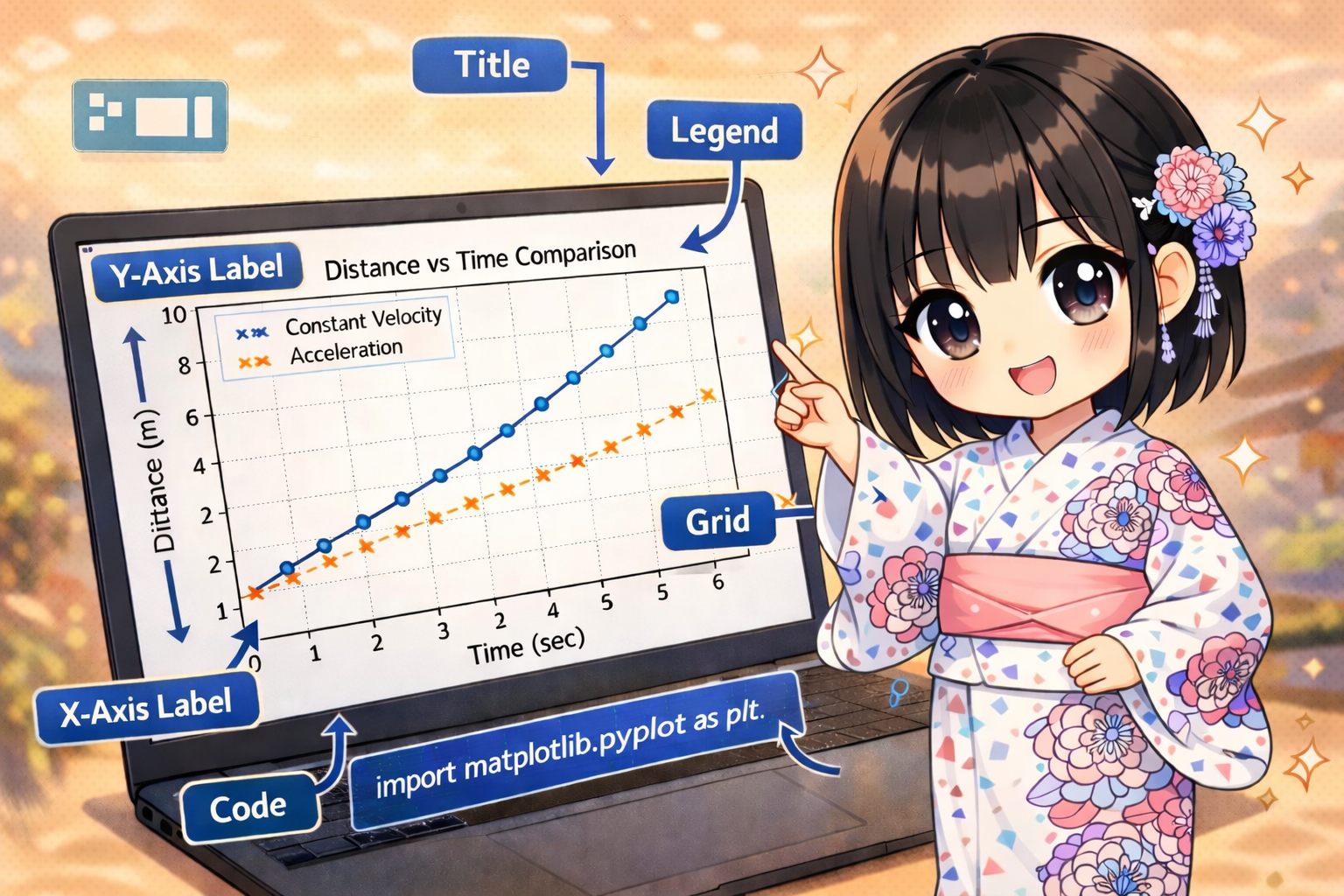
The following code plots data representing the relationship between “Time” and “Distance” in a physics experiment. It demonstrates how to configure various labels and range settings.
import matplotlib.pyplot as plt

# Prepare data (Time and Distance)
time_points = [0, 1, 2, 3, 4, 5]
distance_experiment_a = [0, 10, 20, 30, 40, 50]
distance_experiment_b = [0, 5, 12, 25, 45, 70]

# Generate Figure and Axes
fig = plt.figure(figsize=(8, 5))
ax = fig.add_subplot(1, 1, 1)

# Plot data (The label argument is used in the legend)
ax.plot(time_points, distance_experiment_a, label="Constant Velocity", marker="o")
ax.plot(time_points, distance_experiment_b, label="Acceleration", marker="x", linestyle="--")

# Set Title and Axis Labels
ax.set_title("Distance vs Time Comparison")
ax.set_xlabel("Time (sec)")
ax.set_ylabel("Distance (m)")

# Set Display Range (Limits)
ax.set_xlim(left=0, right=6)
ax.set_ylim(bottom=0, top=80)

# Display Grid Lines
ax.grid(True)

# Display Legend (Position can be specified with loc)
ax.legend(loc="upper left")

# Show the graph
plt.show()
Code Explanation
You can customize your graph by calling methods on the Axes object (the ax variable in this example) created by fig.add_subplot().
Titles and Axis Labels
These are used to clearly show the subject of the graph and what each axis represents.
- ax.set_title(str): Displays a title at the top of the graph.
- ax.set_xlabel(str): Sets the label for the X-axis (horizontal).
- ax.set_ylabel(str): Sets the label for the Y-axis (vertical).
Setting the Display Range (Limits)
This is used when you want to manually fix the range of the axes instead of letting them adjust automatically.
- ax.set_xlim(left, right): Sets the minimum (left) and maximum (right) values for the X-axis.
- ax.set_ylim(bottom, top): Sets the minimum (bottom) and maximum (top) values for the Y-axis.
You can also specify these by order, such as ax.set_xlim(0, 6), without using keyword arguments.
Grid Lines and Legends
These elements help make the data values easier to read.
- ax.grid(True): Displays grid lines. Passing
Trueenables the grid. - ax.legend(): Displays the legend. For this to work, you must specify a
labelargument when callingax.plot(). You can control the position of the legend (e.g., “upper left”, “lower right”) using thelocargument.