Two Main Styles in Matplotlib
There are two main ways to create graphs using Matplotlib: the “Pyplot Style (MATLAB Style)” and the “Object-Oriented Style.”
The Pyplot style is simple and suitable for small scripts or quick data checks. In contrast, the Object-Oriented style explicitly operates on each element of the graph. This provides high flexibility for complex drawings, such as arranging multiple graphs or performing detailed customizations.
1. Object-Oriented Style (Recommended Style)
In the Object-Oriented style, you create a Figure object (the drawing area) and an Axes object (the graph area inside the figure). You then call methods on each of these objects.
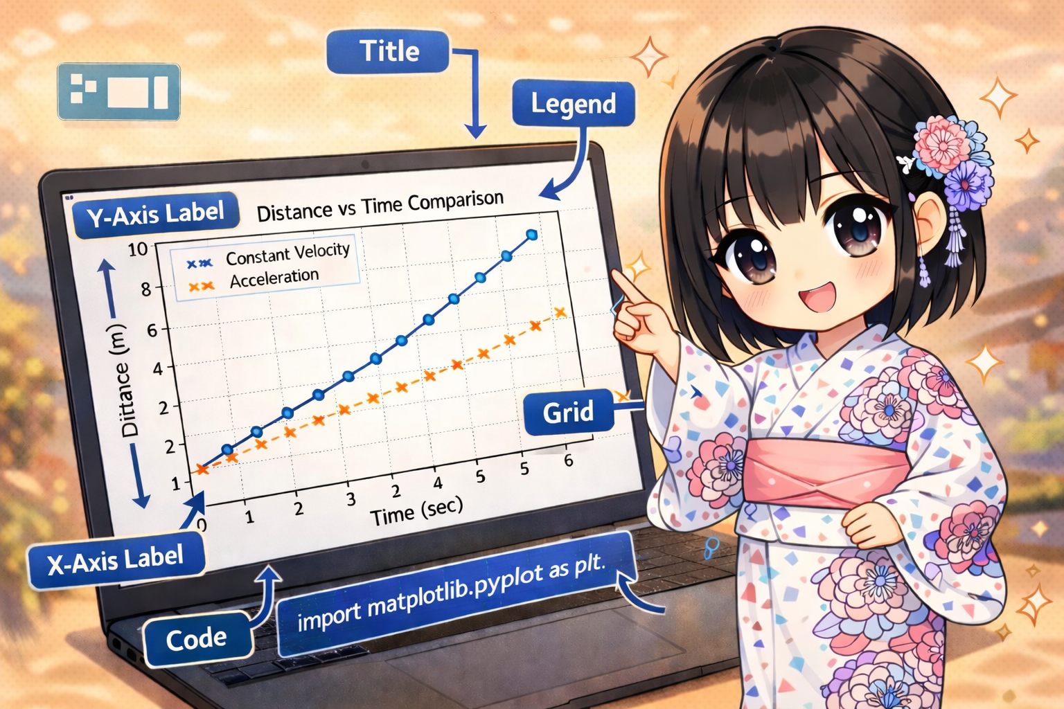
import matplotlib.pyplot as plt

# Sample data for advertising spend and sales revenue
advertising_spend = [100, 250, 400, 600, 850]
sales_revenue = [1200, 2800, 3900, 6200, 9100]

# Generate Figure and Axes objects
fig = plt.figure(figsize=(8, 5))
ax = fig.add_subplot(1, 1, 1)

# Plotting a scatter plot
ax.scatter(advertising_spend, sales_revenue, color="blue", label="Campaign Results")

# Setting labels and title
ax.legend(["Q1 Performance"])
ax.set_title("Correlation between Ad Spend and Sales")
ax.set_xlabel("Spend (USD)")
ax.set_ylabel("Revenue (USD)")

# Display the graph
plt.show()
2. Pyplot Style (MATLAB Style)
In the Pyplot style, the matplotlib.pyplot module internally manages the “currently active graph.” Since you call functions directly without needing to manage objects, you can write less code.
import matplotlib.pyplot as plt

# Sample data for advertising spend and sales revenue
advertising_spend = [100, 250, 400, 600, 850]
sales_revenue = [1200, 2800, 3900, 6200, 9100]

# Direct plotting using Pyplot style
plt.scatter(advertising_spend, sales_revenue, color="red", label="Campaign Results")

# Various settings
plt.legend(["Q1 Performance"])
plt.title("Correlation between Ad Spend and Sales")
plt.xlabel("Spend (USD)")
plt.ylabel("Revenue (USD)")

# Display the graph
plt.show()
Execution Results
Running the code above displays a scatter plot in the specified style.
- Title: Correlation between Ad Spend and Sales
- X-axis: Spend (USD) [Scales from 100 to 850]
- Y-axis: Revenue (USD) [Scales from 1200 to 9100]
- Plot Content: Data points appear as blue dots (Object-Oriented style) or red dots (Pyplot style).
- Legend: Displays “Q1 Performance”.
Comparison and Usage of the Two Styles
The two styles have the following characteristics:
| Item | Object-Oriented Style | Pyplot Style |
| Main Use | Complex graphs, multiple plots | Simple drawings, interactive use |
| Control | Very high (Explicit) | Limited (Implicit) |
| Readability | Clear structure for large development | Intuitive for short code |
We recommend using the “Object-Oriented Style” because it is the current standard and offers better scalability for the future. It is important to stick to one style within a single program to avoid confusion.