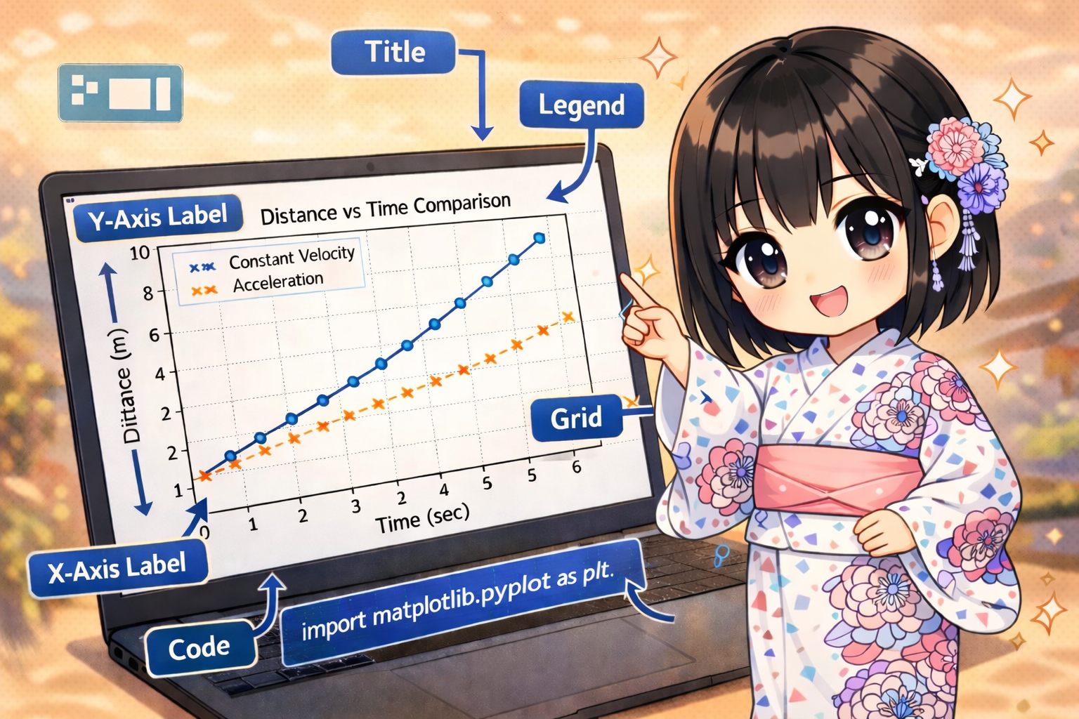
When using Matplotlib for data visualization, the first step to creating complex layouts is understanding the relationship between the “Figure” and “Axes.”
Relationship Between Figure and Axes
Matplotlib graphs are managed in a hierarchical structure:
- Figure: This refers to the entire canvas used for drawing.
- Axes: This is the area where the actual graph (coordinates, plots, labels, etc.) exists. You can place multiple Axes within a single Figure.
Basic Drawing Workflow
The following is a highly scalable drawing workflow using the object-oriented interface. This example visualizes the “daily response time” of a web service.
import matplotlib.pyplot as plt

# Data definition (Daily response time of a web service)
days = ["Mon", "Tue", "Wed", "Thu", "Fri", "Sat", "Sun"]
response_times = [120, 135, 110, 150, 145, 130, 125]  # Unit: ms

# 1. Create a Figure (Canvas)
fig = plt.figure(figsize=(8, 5))

# 2. Add an Axes (Drawing area)
# add_subplot(rows, columns, index)
ax_main = fig.add_subplot(1, 1, 1)

# 3. Execute plotting
ax_main.plot(days, response_times, marker='o', linestyle='-', color='teal', label='Response Time')

# 4. Decorate the graph
ax_main.set_title("Daily Server Response Time")
ax_main.set_xlabel("Day of Week")
ax_main.set_ylabel("Time (ms)")
ax_main.legend()
ax_main.grid(True, linestyle='--', alpha=0.7)

# 5. Display the graph
plt.show()
Execution Result: A canvas is generated showing a line graph of the response time from Monday to Sunday. By using add_subplot(1, 1, 1), the entire area (1 row, 1 column, 1st position) is designated as the drawing range.
Placing Multiple Graphs (Subplots)
By using add_subplot, you can arrange multiple graphs showing different data within a single Figure. This example shows a 2×2 grid layout for analyzing EC site performance (Revenue, Orders, Average Order Value, and Stock).
import matplotlib.pyplot as plt

# Dataset generation (EC site KPI data)
categories = ["Electronics", "Fashion", "Home", "Beauty"]
revenue = [500000, 320000, 450000, 210000]
orders = [120, 250, 180, 90]
avg_price = [4166, 1280, 2500, 2333]
stock = [45, 120, 85, 200]

# Create Figure
fig = plt.figure(figsize=(12, 10))

# 1. Revenue (1st in 2x2 grid)
ax1 = fig.add_subplot(2, 2, 1)
ax1.bar(categories, revenue, color='royalblue')
ax1.set_title("Total Revenue")
ax1.set_ylabel("Amount (JPY)")

# 2. Number of Orders (2nd in 2x2 grid)
ax2 = fig.add_subplot(2, 2, 2)
ax2.plot(categories, orders, marker='s', color='darkorange', linewidth=2)
ax2.set_title("Number of Orders")
ax2.set_ylabel("Count")

# 3. Average Order Value (3rd in 2x2 grid)
ax3 = fig.add_subplot(2, 2, 3)
ax3.scatter(categories, avg_price, s=100, color='crimson')
ax3.set_title("Average Order Value")
ax3.set_ylabel("Price (JPY)")

# 4. Inventory Levels (4th in 2x2 grid)
ax4 = fig.add_subplot(2, 2, 4)
ax4.plot(categories, stock, marker='^', color='forestgreen', linestyle='--')
ax4.set_title("Inventory Levels")
ax4.set_ylabel("Units")

# Automatic layout adjustment
fig.tight_layout()

# Display
plt.show()
Execution Result: A single window is divided into four sections. It displays a bar chart for revenue (top left), a line chart for orders (top right), a scatter plot for order values (bottom left), and a dashed line graph for stock levels (bottom right) simultaneously.
Key Points for Efficient Management
When handling multiple graphs, calling fig.tight_layout() automatically prevents axis labels and titles from overlapping with adjacent graphs. Additionally, by changing the arguments of add_subplot to something like (2, 3, i), you can consolidate even more graphs (e.g., 2 rows and 3 columns) into one screen for easier comparison and analysis.